Experience-first social connection
Unveil is an activity-first, on-demand social experience focused on helping people say yes to real-world connections in the moment. This project explores how system-generated activities, intentional language, and trust-building design can lower social pressure while encouraging meaningful participation.
View prototype
Role
UX/UI Designer
Timeframe
6 weeks
Including 2-week winter break
Collaborators
Unveil's founder
Two other UX/UI Designers
Methods
UX Writing
Persona Development
Usability Testing
Project Management
Stakeholder Communication

Problem statement
Young professionals, recent immigrants, and students want meaningful social connections without the pressure of profile-based matching or extensive planning. How might we help people discover and join shared experiences in a low-pressure way while maintaining safety and trust?
Solutions
Unveil is an interest- and activity-based mobile experience that connects users to in-the-moment social connections without high effort and planning.
Project Highlights
Designed an activity-first, interest-based MVP supporting the first real-world social connection
Led research synthesis and persona creation, identifying safety as the primary user concern
Navigated late-stage scope changes, making trade-offs and advising future research
Received strong client feedback on design quality, intentionality, and collaboration
Research & Insights:
Safety as a Core Need
This research explored how users engage in social activities, evaluate activity-first platforms, and establish trust when meeting new people.
Competitive Analysis
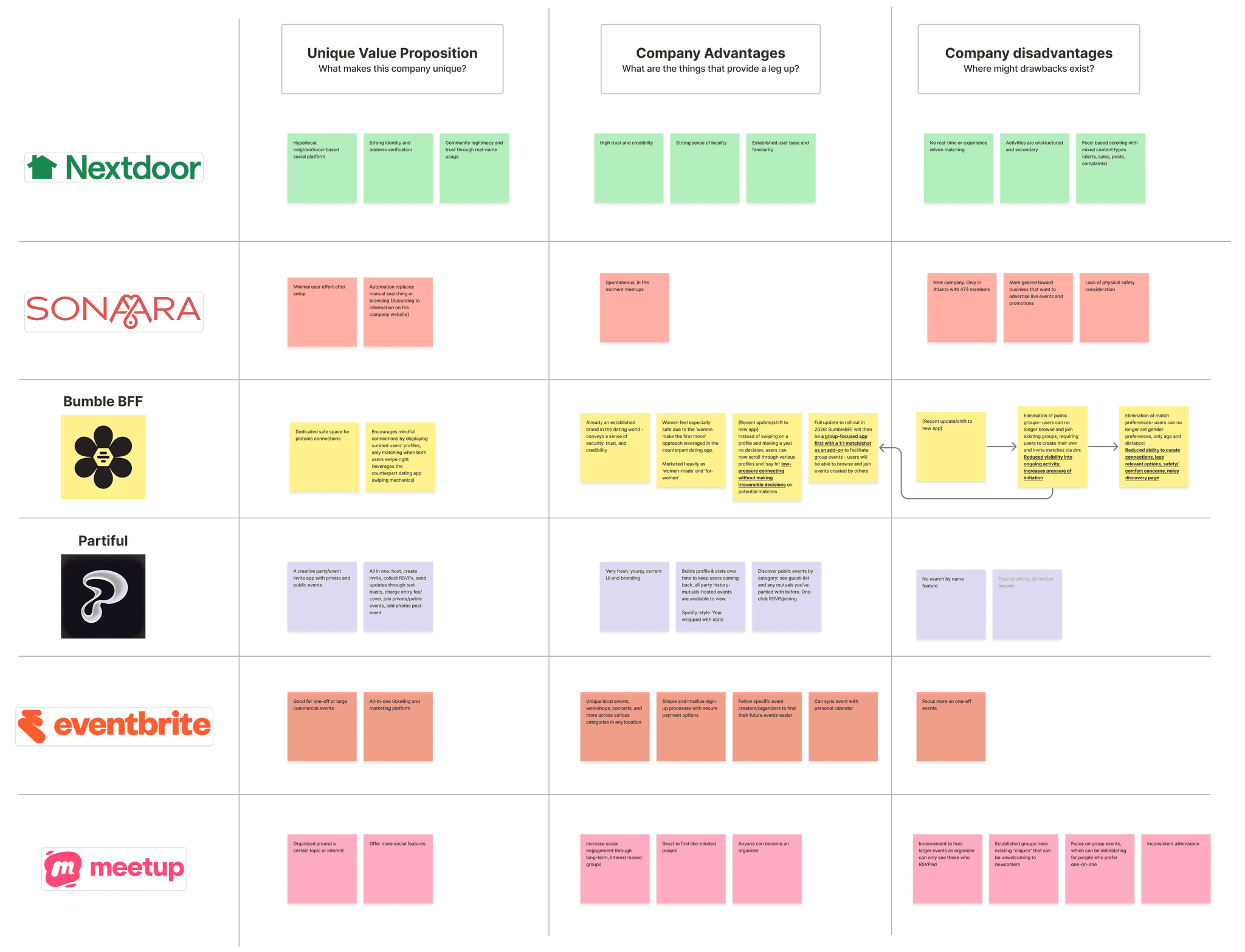
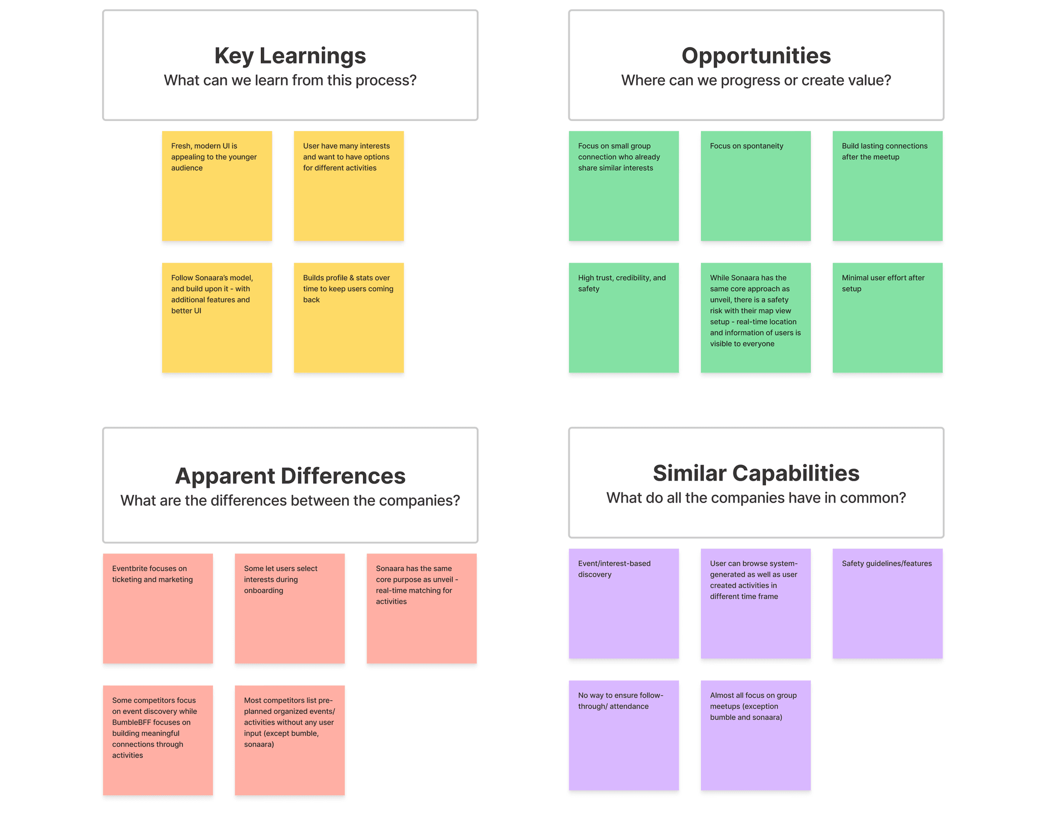
We first reviewed Unveil’s founder’s presentation and conducted a competitive analysis of Bumble BFF, MeetUp, Partiful, and other social apps for design patterns that current users who are looking for social connections are familiar with. We identified Sonaara as the primary competitor due to its casual nature and in-the-moment connections.
Safety Feature Brainstorm
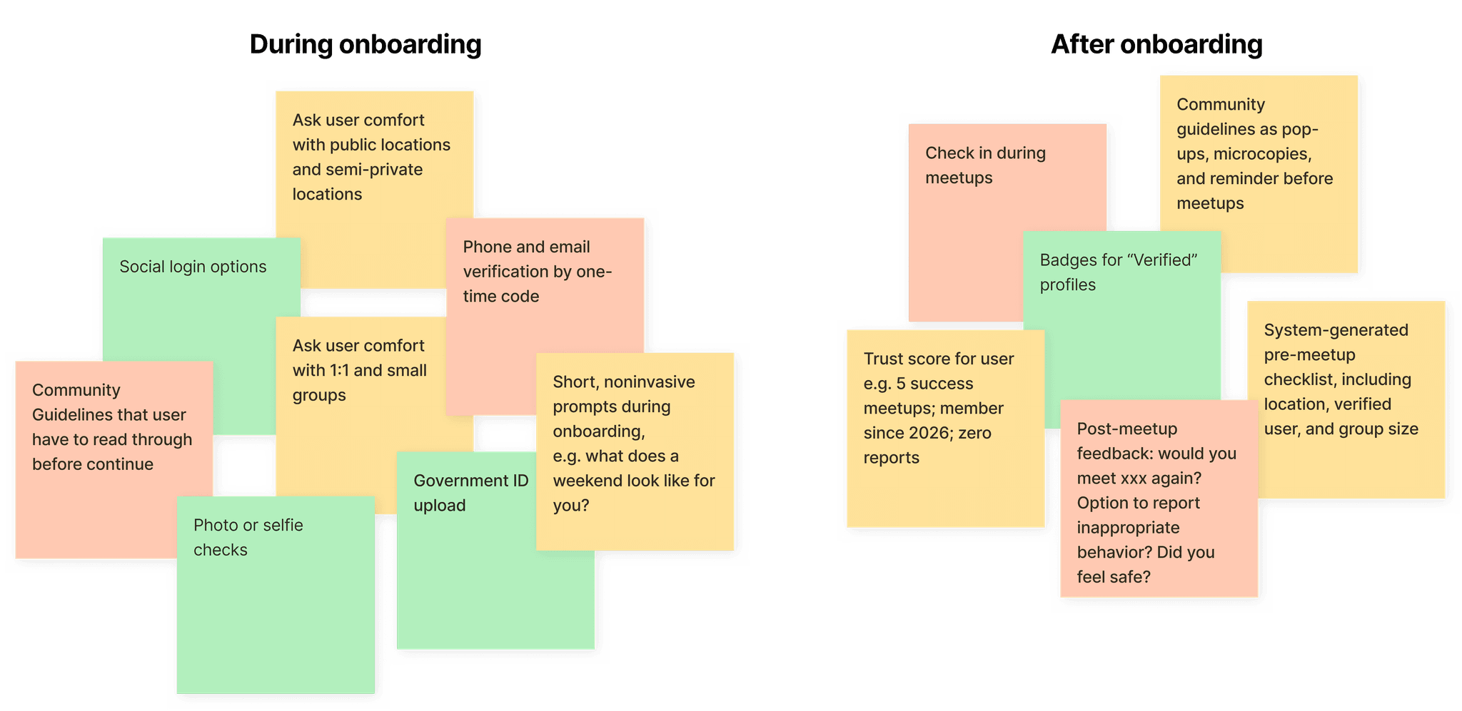
Based on the insights, each designer independently explored ideas, after which I facilitated a collaborative review session to synthesize our concepts. We then reviewed these ideas against the client’s existing safety requirements and MVP constraints to determine what would be both feasible and most impactful for first-time user confidence.
As a result, we prioritized one-time code verification as the primary onboarding flow for the MVP.
User Interview and Affinity Mapping
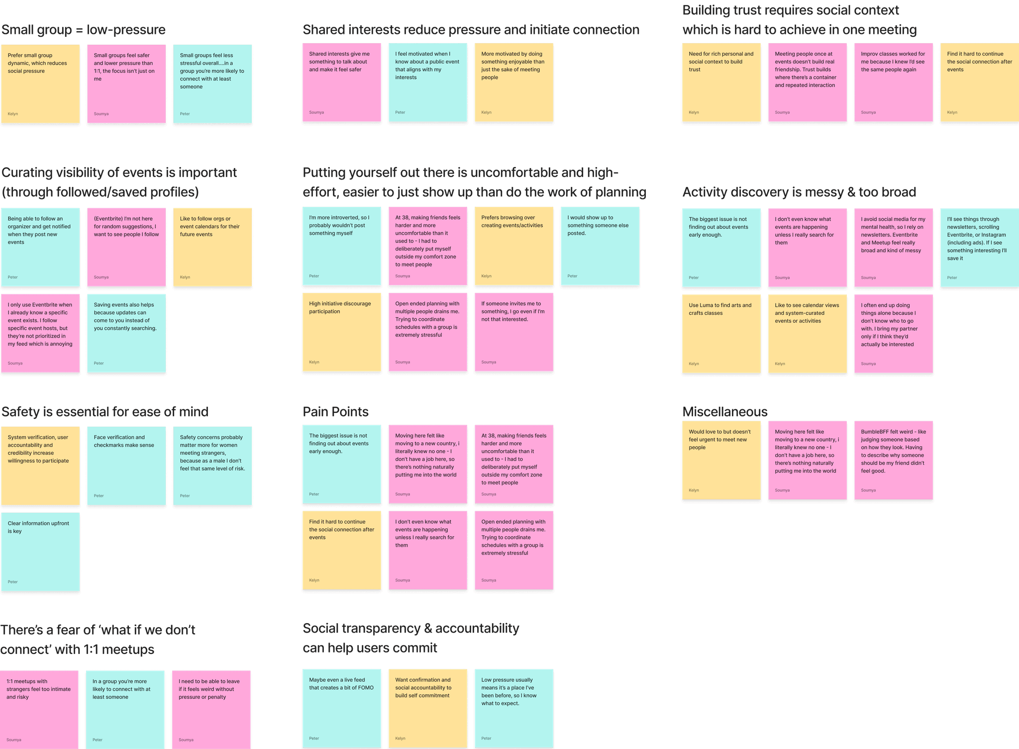
Our team each conducted one user interview (three total) to learn about user behaviors, needs, and motivations, as well as to validate the value of the features shared by Unveil’s founder. Participants were between 25 and 40 years old, had experience moving to a new city or country, and were interested in socializing outside of dating apps.
We synthesized the interviews using an affinity map, which revealed a clear tension: users were excited by the idea of spontaneous, low-pressure hangouts, but safety and trust were critical decision factors when meeting strangers for new activities.
To differentiate Unveil from other social apps, we positioned it with a spontaneous, low-pressure format with stronger safety signals and interest-based matching, rather than profile-based.
Project Goal
To create an MVP to validate Unveil’s concept and explore, test, and refine user flows, safety signals, and online interactions that help users feel confident making their first real-world social connection
Personas
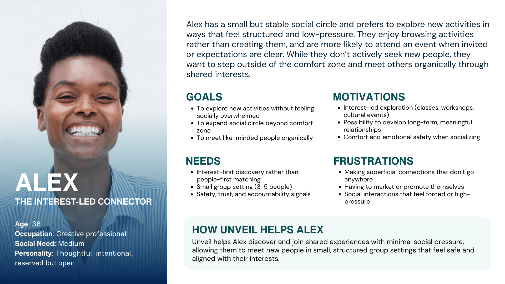
I led persona creation to represent the key user types: people with medium social needs, who want to explore new experiences without high effort or planning.
Design principles
Reduce hesitation at every step
Prioritize in-the-moment action fueled by interest-based discovery
Balanced safety with approachability
Building Trust through Intentional Design
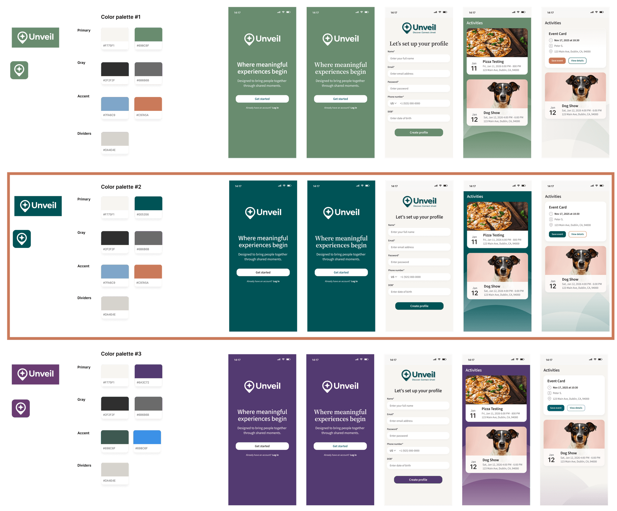
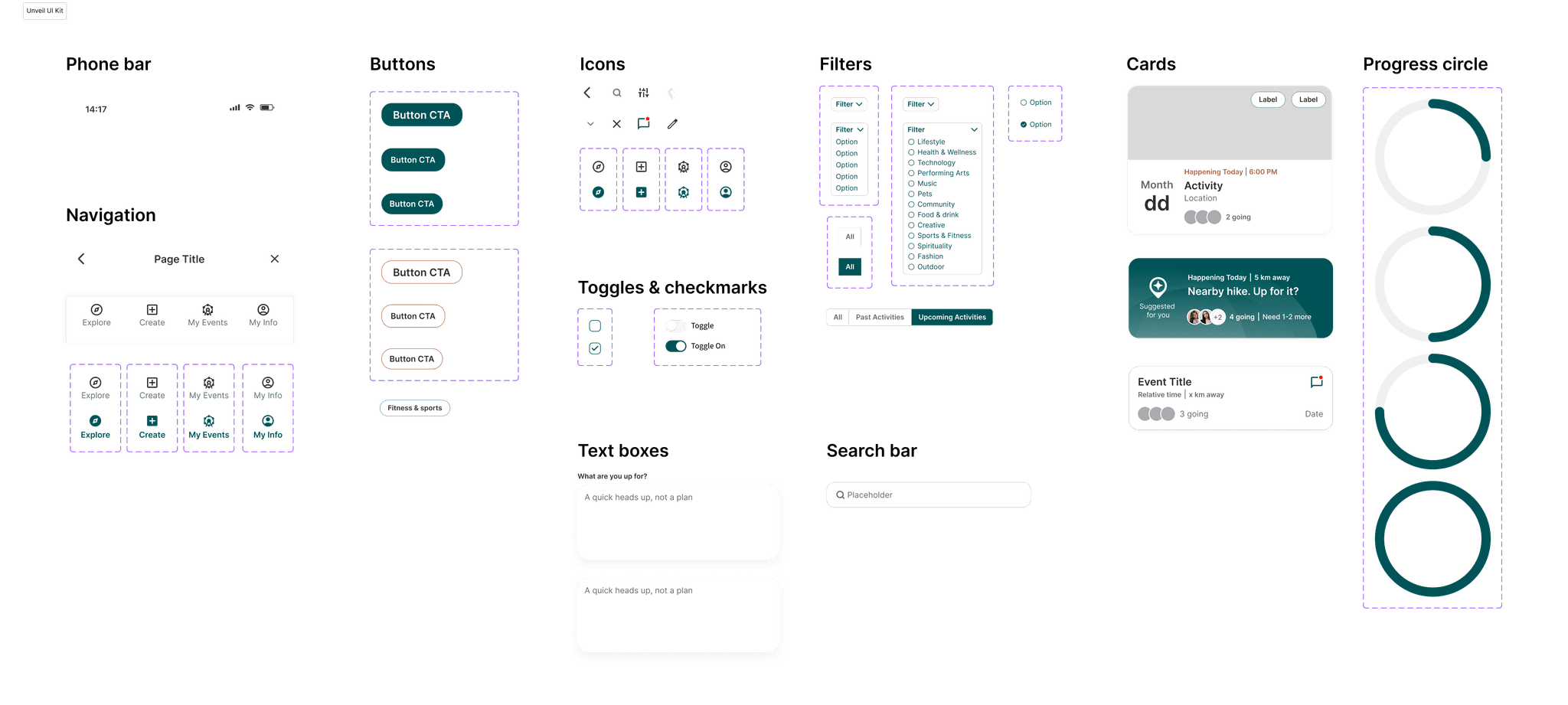
Brand Exploration
Color evaluation survey suggests that users like the deep muted teal / evergreen palette because the green undertone is calming and approachable, which reflects Unveil’s mission about creating meaningful experiences, not urgency or dopamine hits.
reflect principle 3
Sitemap
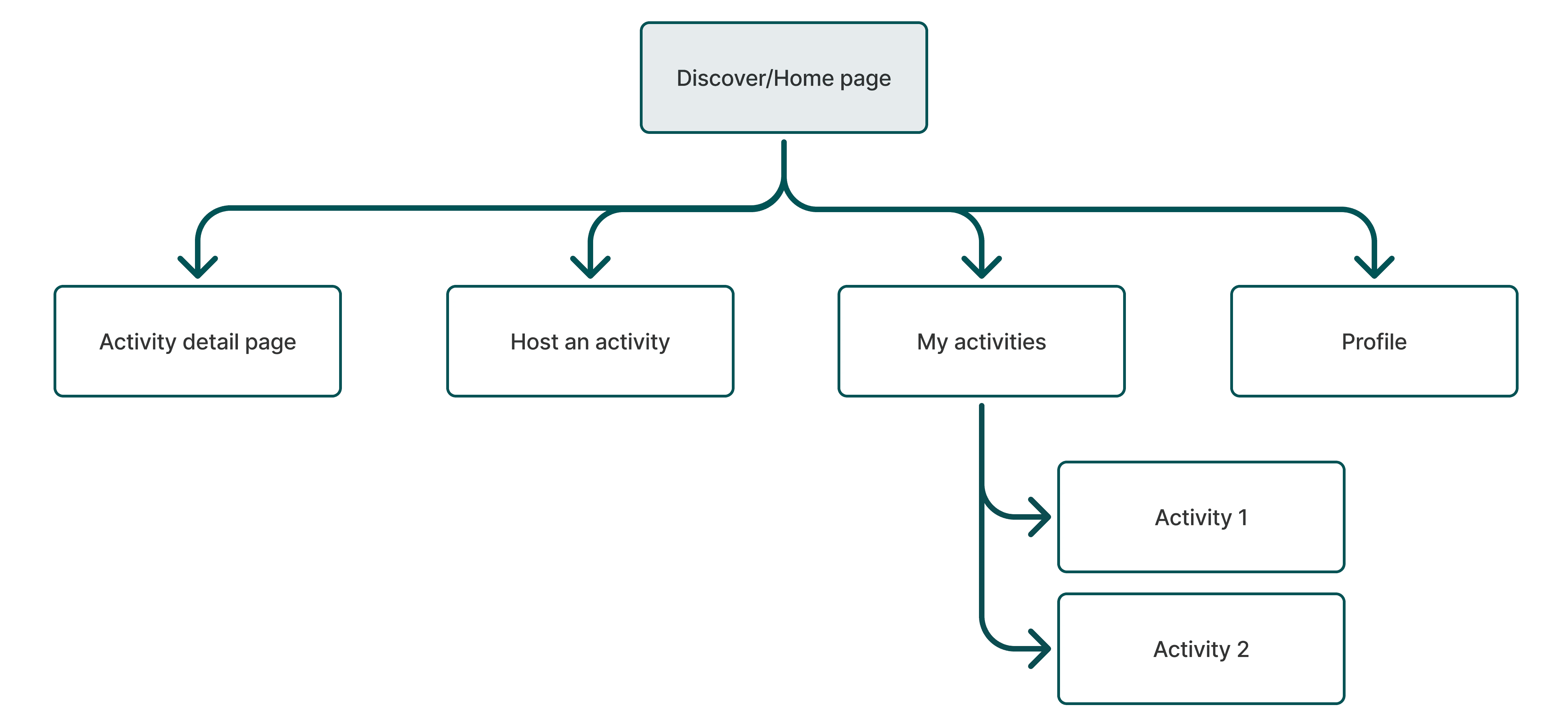
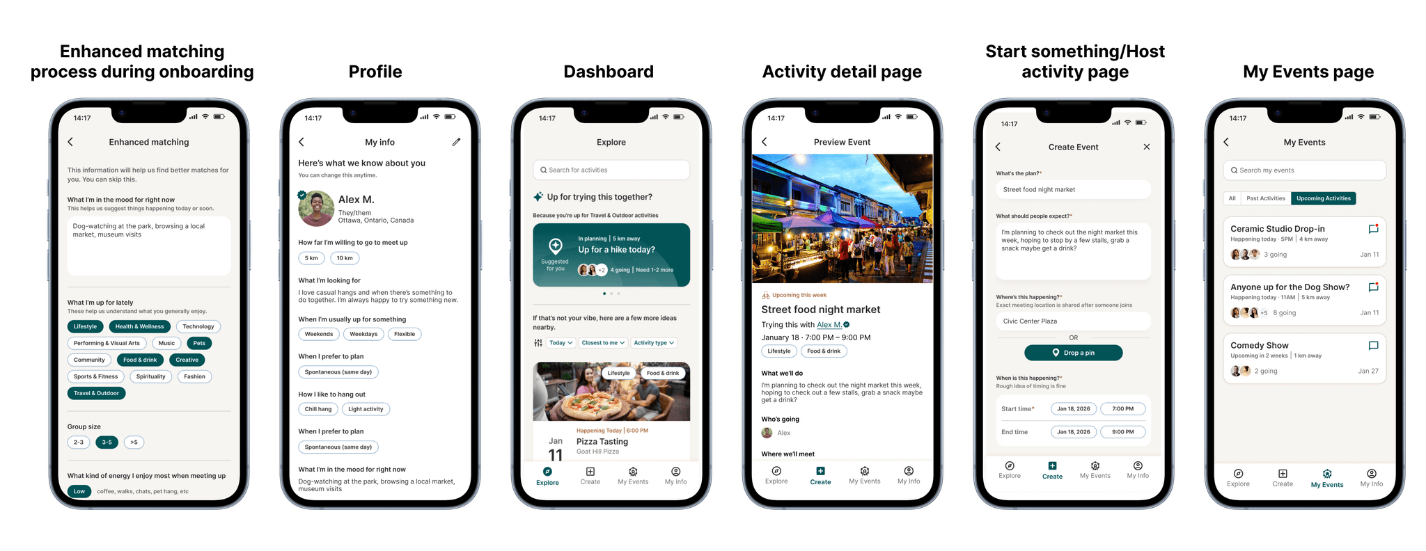
We created the sitemap detailing Unveil's pages and how they are organized and connected.
Low-fidelity Wireframe
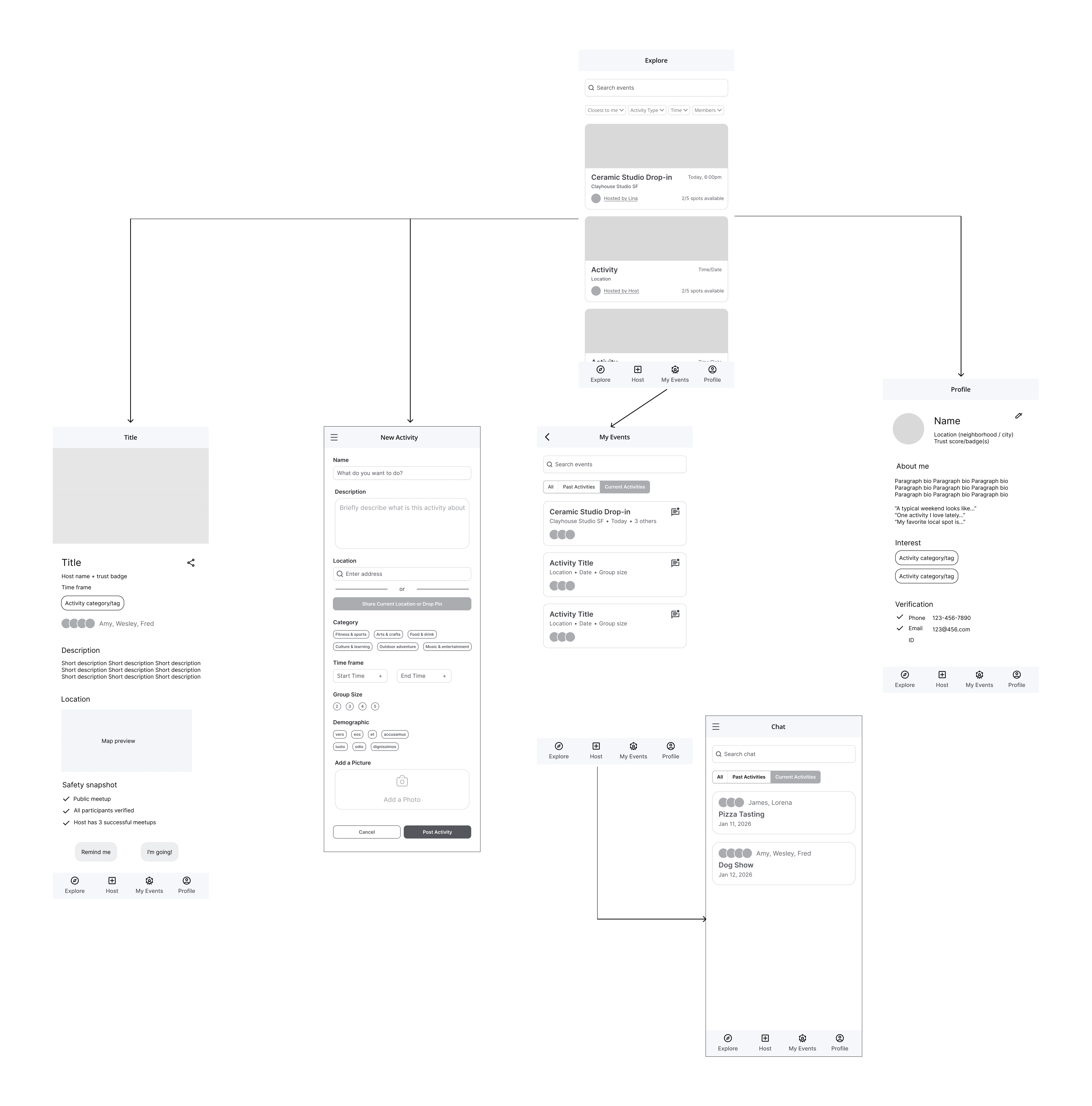
To efficiently cover all necessary screens, we divided the workload: each designer took ownership of 2 key screens while collaborating on flow and interaction decisions.
I led the design of the Activity Detail and Profile pages and brainstormed various low-fi wireframes to explore different options.
High-fidelity Wireframes — My Contributions
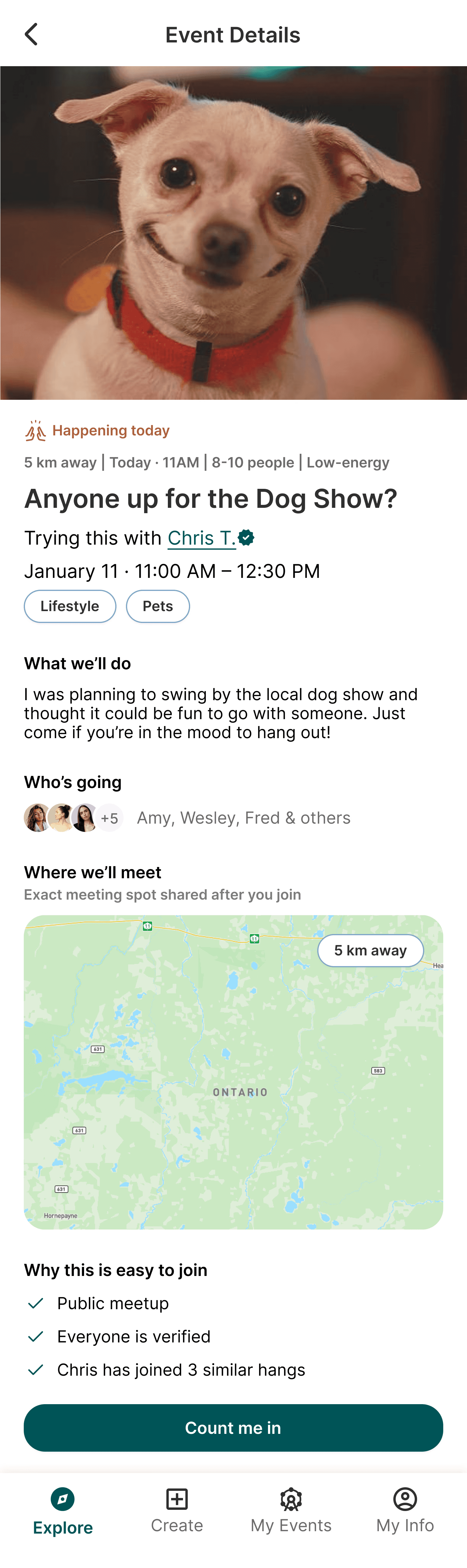
💡What we learned
Casual and low-pressure language and user flow encourage immediate action
✏️ Action
I transformed the copies:
“Description” → “What we’ll do”
“Attendees” → “Who’s going”
“Location” → “Where we’ll meet”
“Register” → “Count me in”
reflect principles 1 & 2
💡 What we learned
Users want strong safety and trust signals
✏️ Action
I introduced a “Why this is easy to join” safety snapshot on activity detail pages
reflect principles 1 & 3
💡 What we learned
Casual and low-pressure language and user flow encourage immediate action
✏️ Action
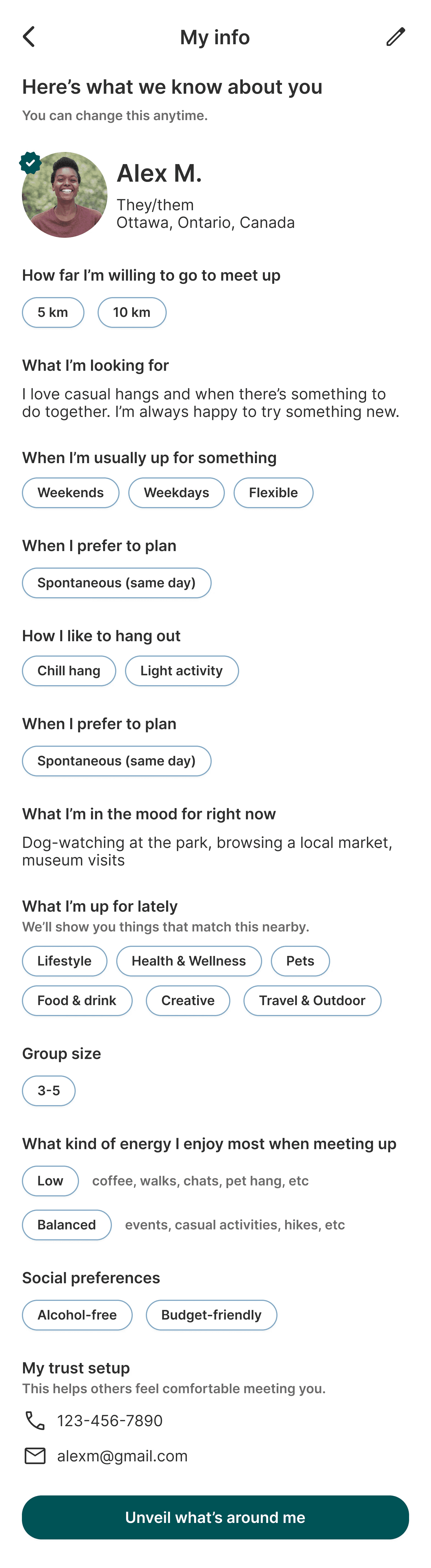
I wrote "Unveil what’s around me” instead of “Finish setup” for the final onboarding CTA
reflect principle 1
High-fidelity Wireframes — Team Contributions
Key contributions from the team that supported the overall experience:
Introduced tiered verification options (phone, ID, selfie) to support different comfort levels around safety
Designed interest-based onboarding questions using quick-select tags to inform matching logic
Removed secondary CTAs like “Remind me” and moved “Invite a friend” post-join to reduce hesitation at the commitment moment
Late-Stage Feature Addition:
System-Generated Activities
As the project progressed, the client identified that system-generated activities — platform-suggested experiences based on user interests — asa key differentiator that needed to be represented in the MVP. This feature would allow users to discover opportunities without relying on browsing or user-created posts.
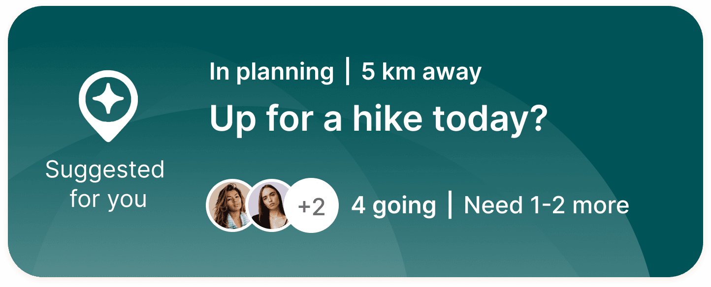
With limited time, our team aligned on scope and prioritized creating a visual concept to validate the idea. We designed a distinct card style to differentiate system-generated activities from user-generated ones.

Testing & Reiteration
Usability tests with 3 participants validated Unveil’s core concept and flows.
What Worked Well
All participants completed browsing, joining, and creating activities with little hesitation
Core functions and interaction flows are intuitive and approachable
Users responded positively to the idea of spontaneous, low-pressure hangouts
System-generated activity cards were understood as distinct from user-generated ones
Key Areas for Improvement
Clarify readiness through time signals
💡 What we learned
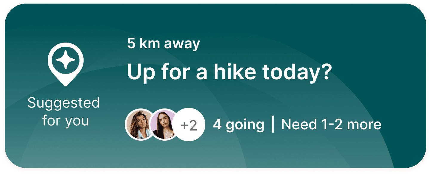
Vague time labels caused hesitation and confusion: users weren’t sure if the activities were tentative or confirmed
✏️ Action
I differentiated activity states with “In planning” tags for system-generated activities and specific times for user-created ones
reflect principles 1 & 2
Before
After
Before
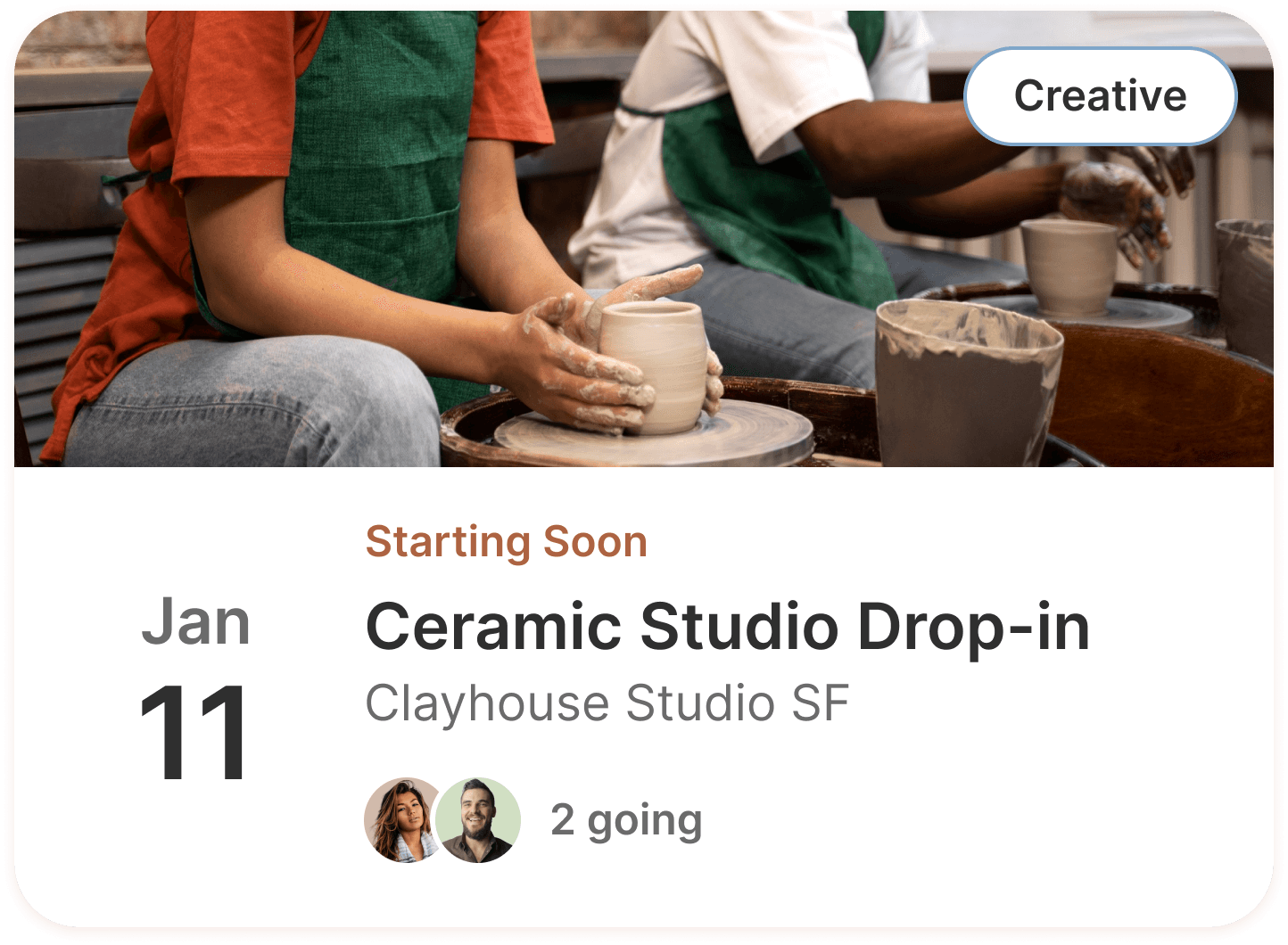
After
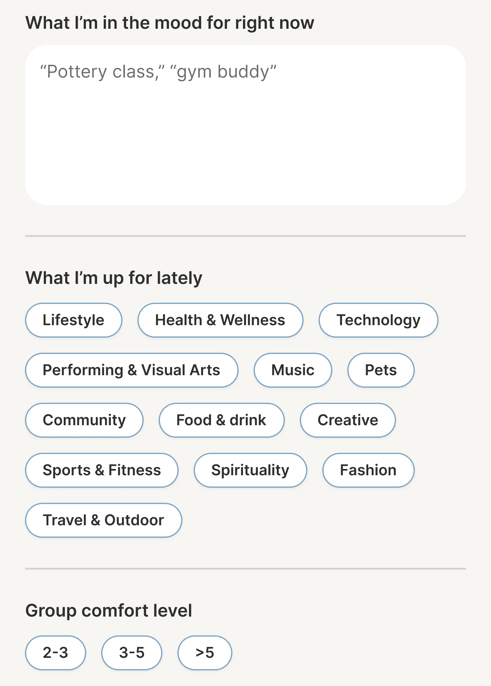
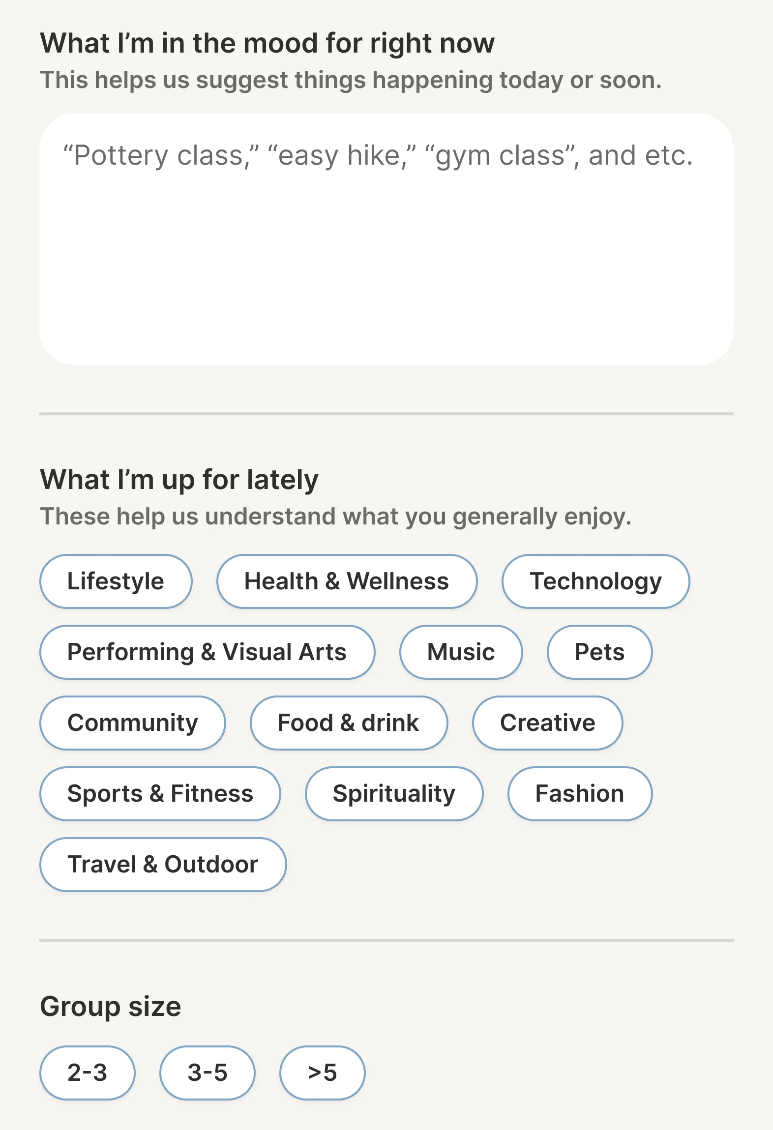
Balancing personality with clarity
💡 What we learned
Casual, brand-aligned language blurred meaning during onboarding, causing users to pause or reinterpret questions
✏️ Action
Added clarifying subtexts to distinguish similar prompts like “What I’m in the mood for right now” vs “What I’m up for lately”
reflect principles 1 & 3
Before
After
Design Recommendations for Next Phase
While usability tests validated the system-generated activity cards, we recommended additional research into the UX process, logic, and user preferences:
How should the system select which activities to create based on users’ onboarding preferences?
What do users expect from system-generated activities?
What happens after users express interest in system-generated activities? If and how does the system facilitate the planning and commitment?
In addition, we recommended further research on users’ safety verification preferences, as usability tests revealed that users expressed different comfort levels with ID-based verification for casual social apps.
MVP Safety Trade-off
Based on user feedback and scope constraints, we prioritized one-time code verification for the MVP onboarding flow to balance safety and accessibility.
The team also explored ID and selfie verification as future safety features. While not included in the MVP, the concept screens were shared with the founder to support future iterations without expanding the current scope.
Overall Learning
This project strengthened my ability to work with stakeholders and navigate shifting requirements under tight timelines.
When the system-generated activities feature was introduced late in the process, we reassessed the scope, aligned with the client, and made intentional decisions about creating UI examples to illustrate the concept while recommending further UX research for the next phase.
I learned to balance client vision with research integrity by distinguishing between validated decisions and concepts that required additional exploration.
Reflection on Collaboration
Working within a three-person UX team strengthened my ability to divide responsibilities strategically while maintaining design cohesion.
By taking ownership of specific tasks, such as persona creation and UX writing, and collaborating on shared decisions, such as tiered verification and onboarding questions, we delivered a unified product that reflects Unveil’s branding and unique positioning.
This experience reinforced the importance of clear, open communications and role definition in teamwork, especially under tight timelines.
The final deliverable MVP demonstrates Unveil’s unique value and future potential. Our research and usability testing validated the core product concept.
We received positive client feedback on design quality, intentionality, and collaboration:
"Kelyn’s presence in check-ins and her role as the main liaison reflected leadership, accountability, and a strong grasp of both the project goals and the UI/UX considerations required to move the work forward."
Read full client feedback on my work ->
"What stood out most was their ability to balance this openness with confidence in their expertise. They welcomed direction and critique while still maintaining their role as design experts, challenging assumptions when appropriate, explaining their rationale clearly, and making informed recommendations that strengthened the final outcome."
Read full client feedback on team ->