A multilingual resource hub for underserved communities
Starting from a blank slate with no existing website, content system, brand identity, or design team, I led the end-to-end design of a digital platform for the Center for Immigrant and Refugee Health (CIRH) that supports community members, service providers, and partners through accessible information architecture, multilingual content systems, and audience-centered resource navigation.
Today, the platform has evolved into a regularly used resource hub, reaching over 24,000 visits and growing unique visitors by 176% year over year.
View website
Role
UX/UI Designer
Information Architect
Content Strategist
Timeframe
Ongoing
Collaborators
Executive Director
Deputy Director
Program Staff
Subject Matter Experts
Methods
Competitive Analysis
Stakeholder Management
Information Architecture
Content Governance
Localization Strategy

CIRH serves multiple distinct audiences who come to the site with very different goals and mental models:

Community members and refugees
who need to find health resources and services quickly, in their own language, with minimal reading burden

Service providers and clinicians
who need program information, training resources, and tools they can use with clients

Researchers and funders
who need to understand what makes CIRH distinct, what outcomes it produces, and why it's worth supporting
The challenge wasn’t simply building a website, but designing a content system that could support those diverse audiences without increasing cognitive load or navigation friction.
The main goal: To serve as a resource hub and navigation tool to connect refugee and immigrant communities with programs and services.
Rather than starting from scratch on user research, I brought:
My MPH training in health communication and behavioral change
My CHES certification grounded in audience-centered communication
I supplemented this with:
Organizational context and research from the central PHI team
Competitive analysis of peer nonprofit and public health organizations to understand content structures and navigation patterns that worked for similar audiences
Stakeholder conversations with Deputy Director, Executive Director, program staff, and refugee health subject matter experts to understand program priorities and organizational goals
Partner and community feedback revealed specific pain points in how people were trying to access resources
The key insight: Users needed to find resources and services quickly with minimal reading across different languages and literacy levels.
Structuring for Multiple Audiences
The Resources section quickly became one of the most visited areas of the site, making the structure critical to helping users locate services efficiently. I needed an information architecture that could support community members, service providers, and partners without overwhelming any group.
I identified two distinct ways users would arrive at resources:
by who they are (a community member vs. a service provider), and
by which population they belong to (Afghan, Ukrainian, AAPI, Arabic-speaking, Latinx communities)
Rather than generalizing these into one list, I worked with the leadership team to built a two-tier structure:
a first-level split by audience type (For Communities / For Partners / Digital Resource Library)
a second-level split by population group (Afghan, Ukrainian, AAPI, Arabic-speaking, Latinx communities)
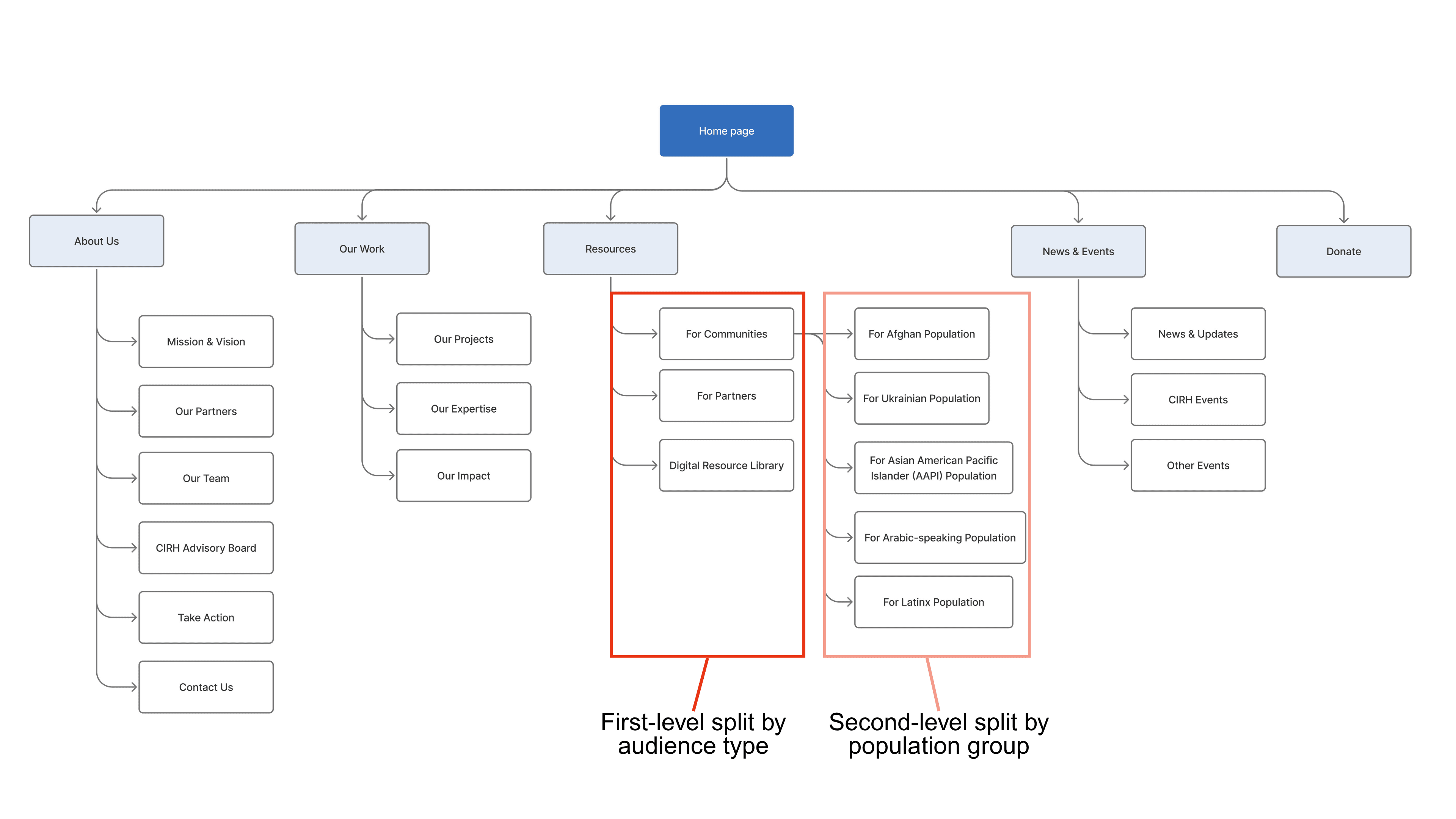
This distinction became especially important as the site grew into a resource hub used by both community members and service providers.
A Dari-speaking Afghan person searching for food assistance and a social worker serving Ukrainian refugees have completely different resource needs. Presenting them with the same undifferentiated list would create friction and slow access to information for both.
Taxonomy & Discoverability: Organizing Resources Around User Needs
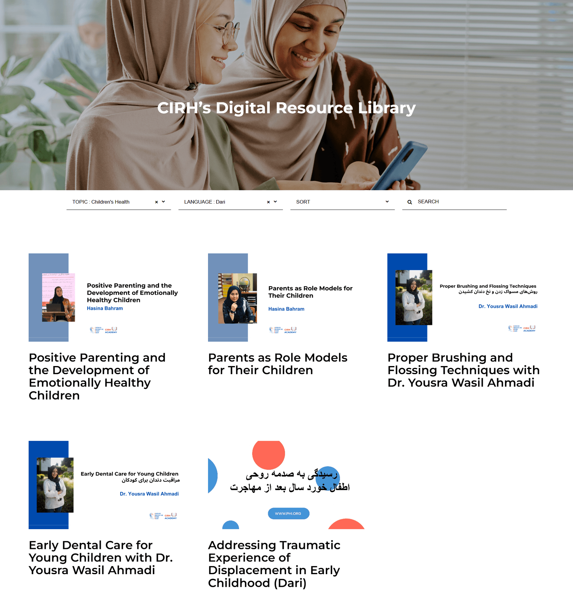
Digital Resource Library
As the resources expanded, content became increasingly difficult to navigate as they were organized by format (reports, guides, toolkits). But conversations with staff and partners revealed that users were searching by topic and subject matter rather than document type.
I proposed and built a centralized resource library with filters for topic and language, a small structural change that significantly improved how efficiently users could locate relevant materials.
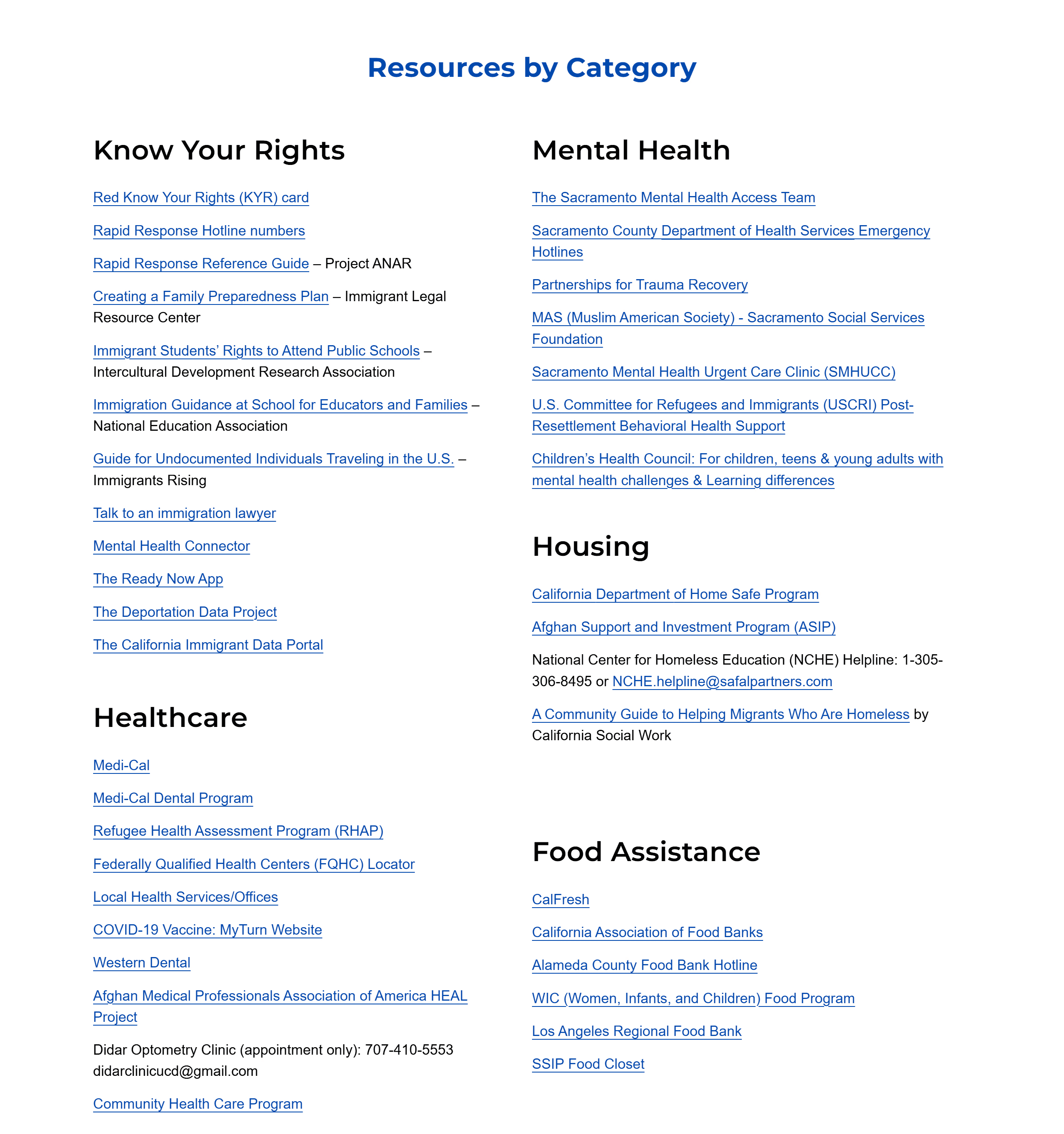
Taxonomy of Services
I worked with health education specialists on reorganizing services into categories, such as:
mental health
food assistance
housing
Know Your Rights
legal resources
rather than by the name of the providing CBO, because users arrive knowing what they need, not which organization provides it.
This structure supports one of the site's primary functions: helping users locate relevant health education materials quickly and efficiently.
Localization & Multilingual Design
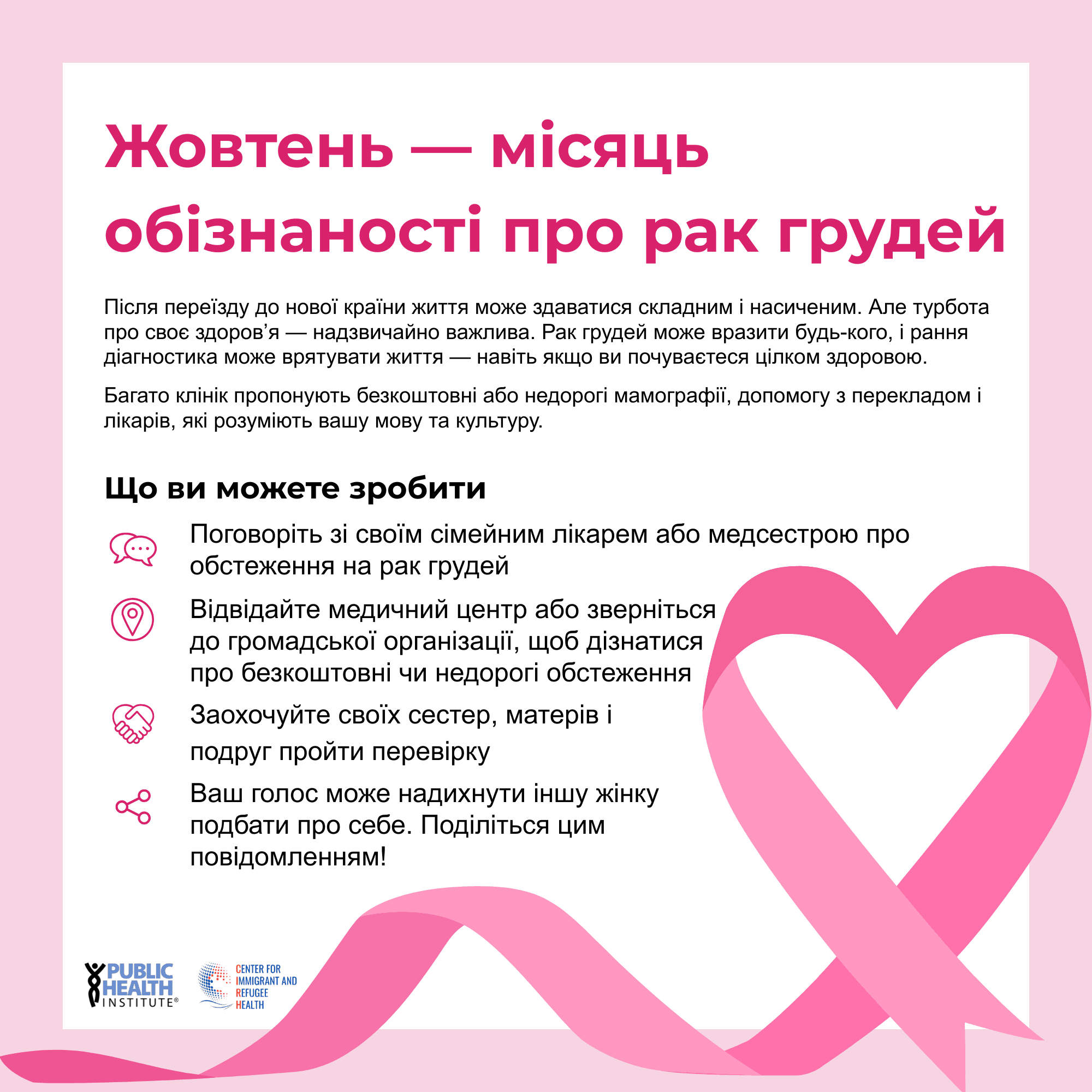
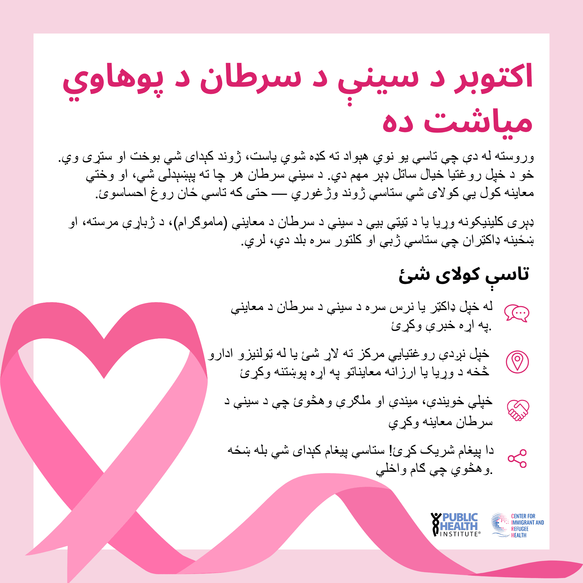
A significant portion of CIRH's audience reads Dari and Pashto, both of which use right-to-left (RTL) scripts.
I embedded Google Translate across the site as a baseline accessibility layer, while recognizing its limitations for nuanced health content.
For materials in these languages, I also
ensured correct RTL alignment
coordinated with health education specialists for linguistic accuracy
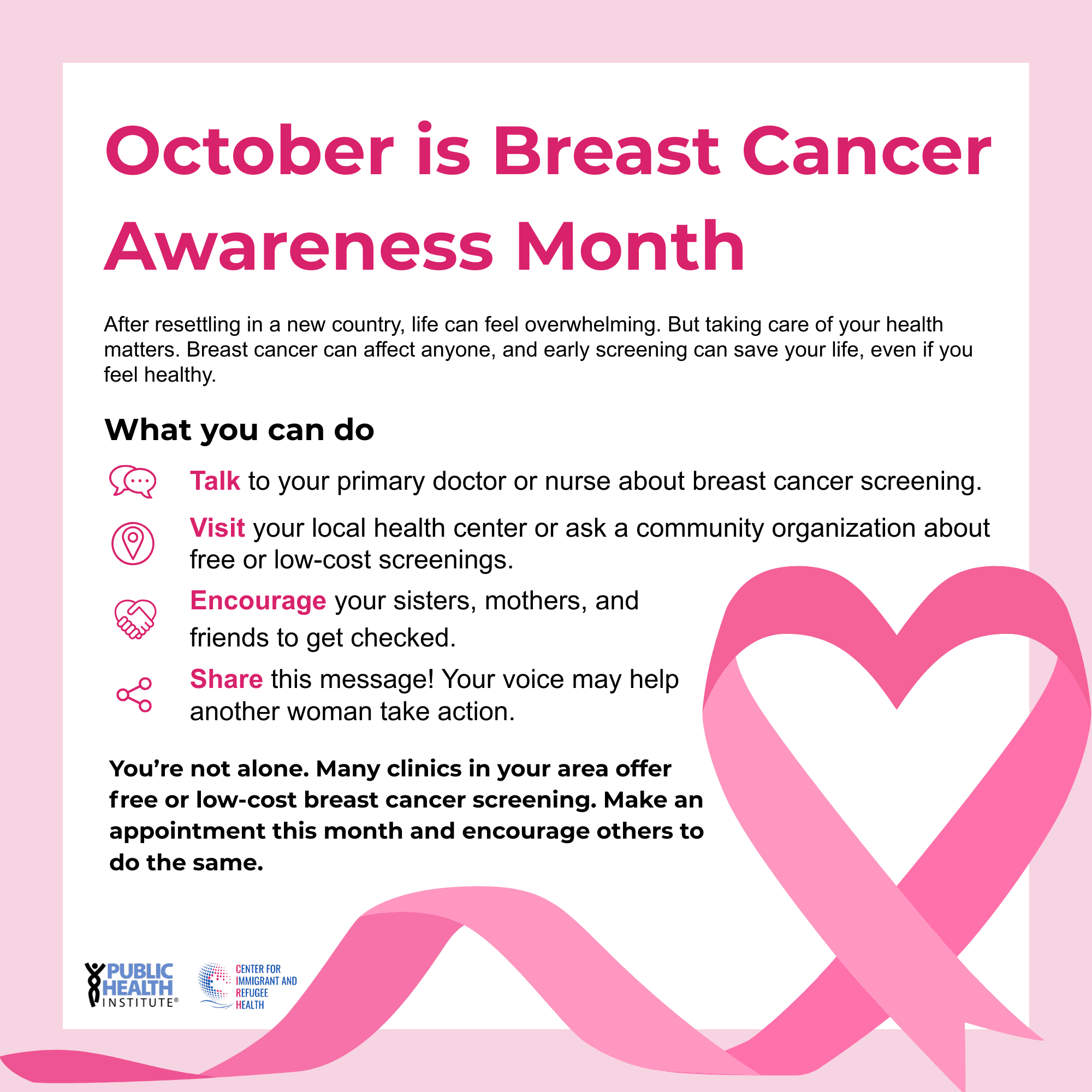
used images where web rendering of RTL text was unreliable
English
Ukrainian
Pashto
Dari
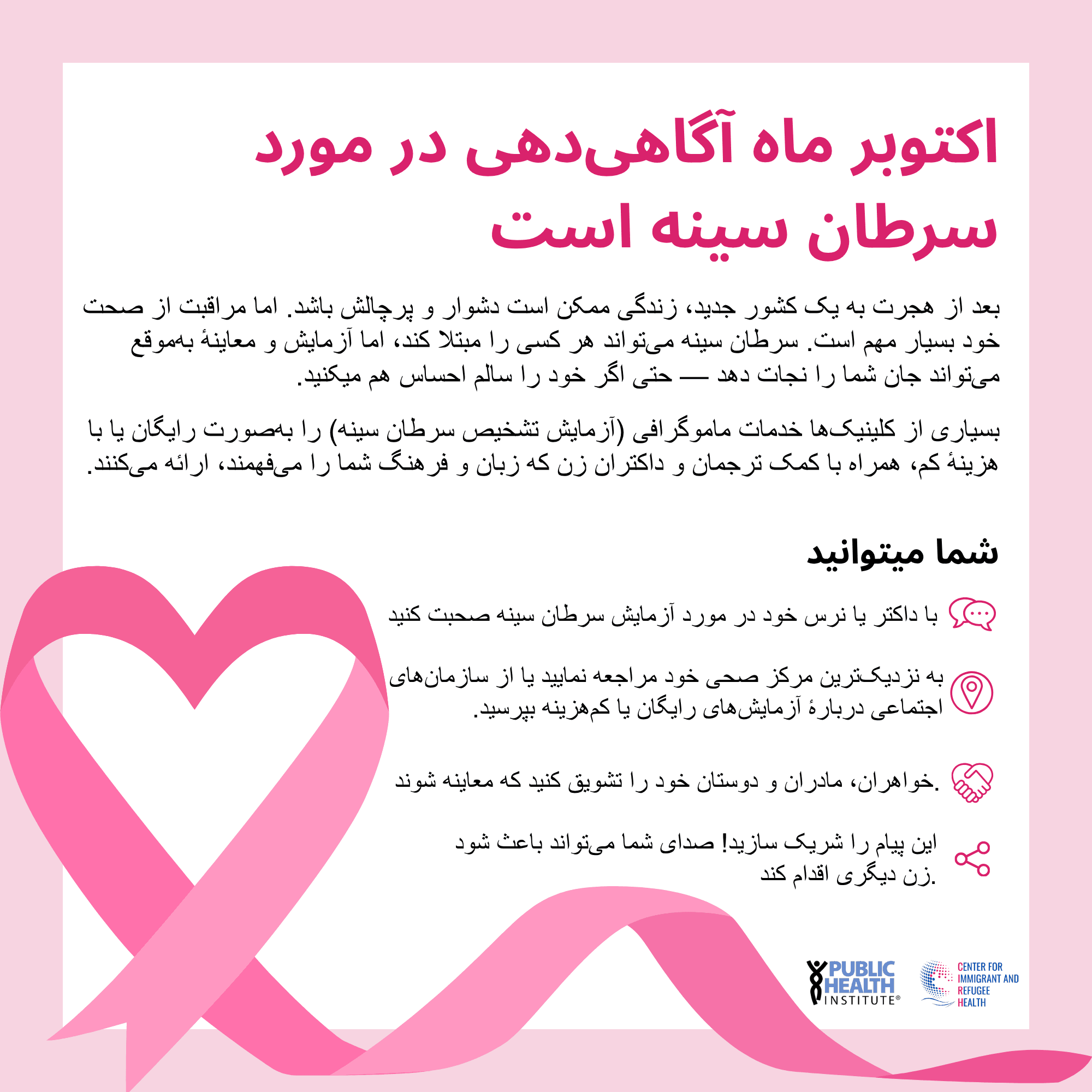
Example: Breast Cancer Awareness Month Educational Materials
I also applied plain language and health literacy principles:
short sentences
active voice
concrete call-to-action buttons
minimal jargon
visual hierarchy that guides users to the most critical information first
Content Governance System
Building the site was only part of the work. I also built the system to keep it accurate, current, and aligned with organizational standards over time.
The content lifecycle I established includes:
A multi-stakeholder review workflow
All new content moves through subject matter expert review, then Deputy Director and Executive Director approval before publication, ensuring accuracy and organizational alignment
Monthly content audits
I systematically review for expired links, outdated resources, and content gaps, then prioritize updates based on analytics and program changes
A branding and language guidelines document
A communications repository I created for staff, covering approved language, tone, and messaging frameworks for external communications, including email and flyers
This governance means the site is a living content system and doesn't degrade over time.
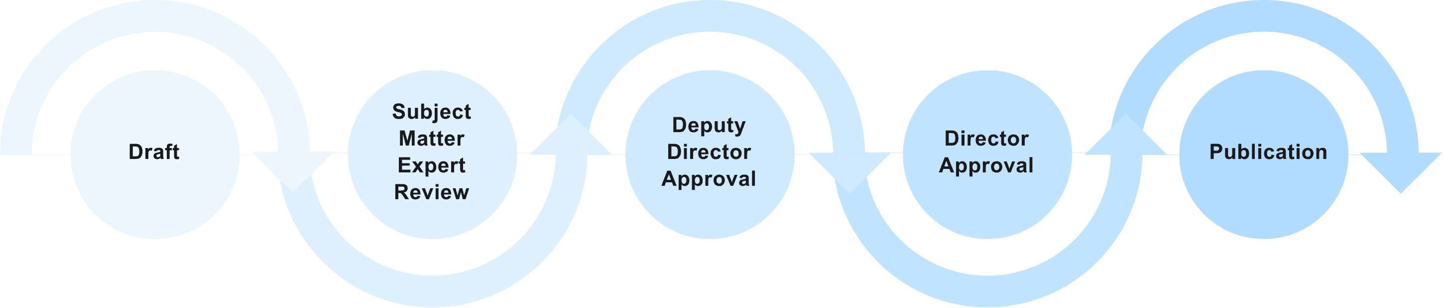
Multi-stakeholder review workflow
Since launch, website traffic has grown steadily year over year, indicating that the platform has evolved from a newly launched website into a regularly used resource hub for both community members and service providers.
+145%
year-over-year
visit growth
+176%
year-over-year
unique visitor growth
24K
total visits
to-date
Questioning Assumptions
This project taught me that designing for underserved populations means questioning assumptions that design processes could take for granted:
that users read left to right
that they know what a "resource library" is for
that they'll navigate by organizational category rather than personal need
Every design decision on this site was made with a specific person in mind: someone who doesn't speak English as their first language, who may not have navigated a health system before, and who needs to find information quickly and trust what they find.
What I'd do differently / next
Platform
Squarespace was the right choice for this organizational context (small team, limited technical resources, ongoing maintenance by non-developers), but a future iteration would benefit from a more flexible platform that allows greater control over interaction design and accessibility customization.
Visual
This site was built before I had formal UX/UI training. If I were redesigning it today, I'd audit color contrast ratios against WCAG AA standards, revisit the visual hierarchy on key pages, and apply a more systematic approach to spacing and typography.
Usability testing
I would conduct formal usability testing with community members and service providers to validate that the navigation structure is working as intended, specifically by testing whether the resource library filters align with how users actually categorize topics.
<< Previous
Building a 0—1 MVP to support meaningful, low-pressure social connection
Next >>